FROM AN IDEA TO AN IMPACTFUL BRAND
The Chosen Youth Outreach Ministry
The challenge
Starting with nothing but a vision, The Chosen Youth Outreach Ministry needed a complete brand identity to reflect their growing mission and connect with their community.
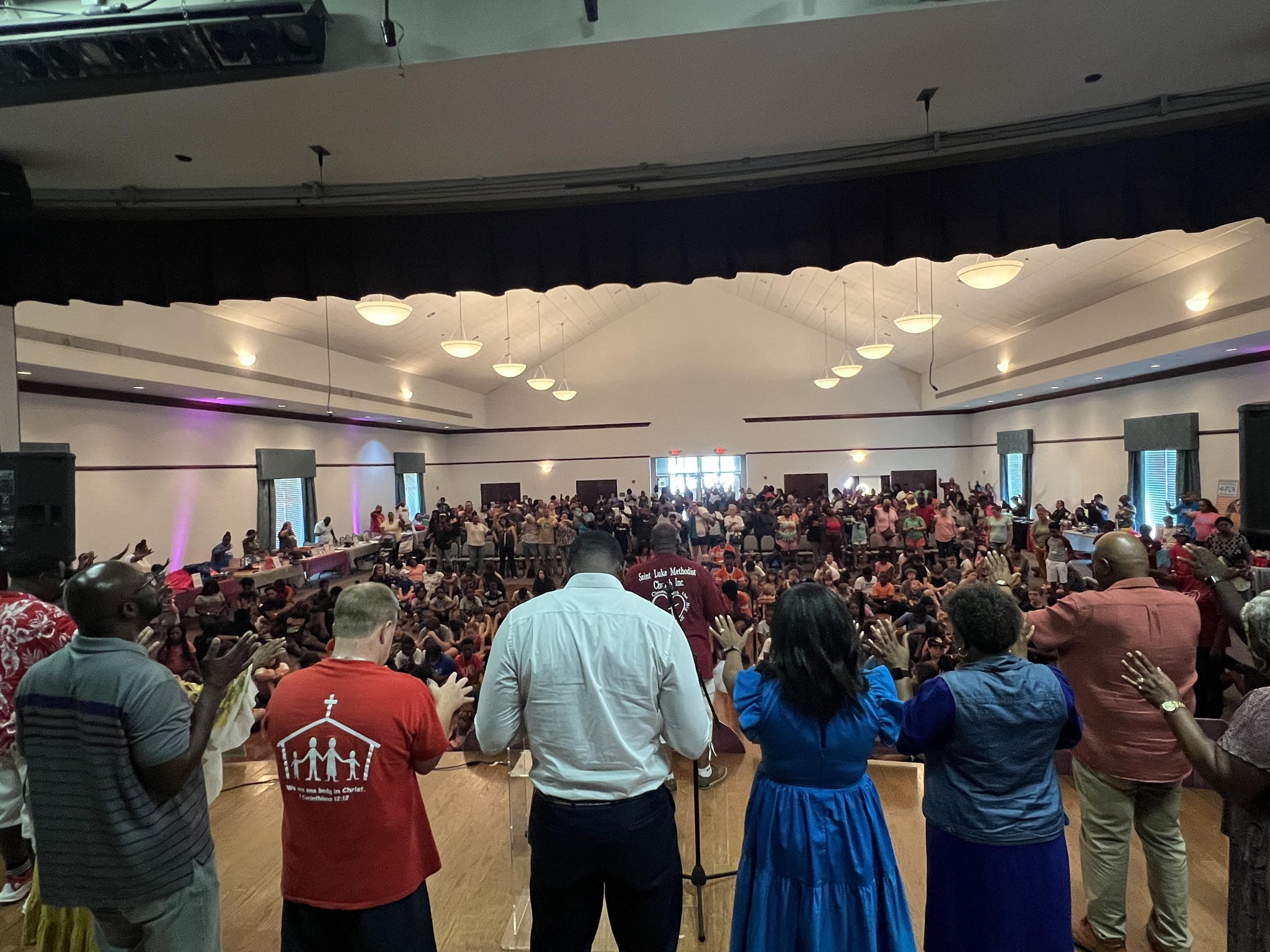
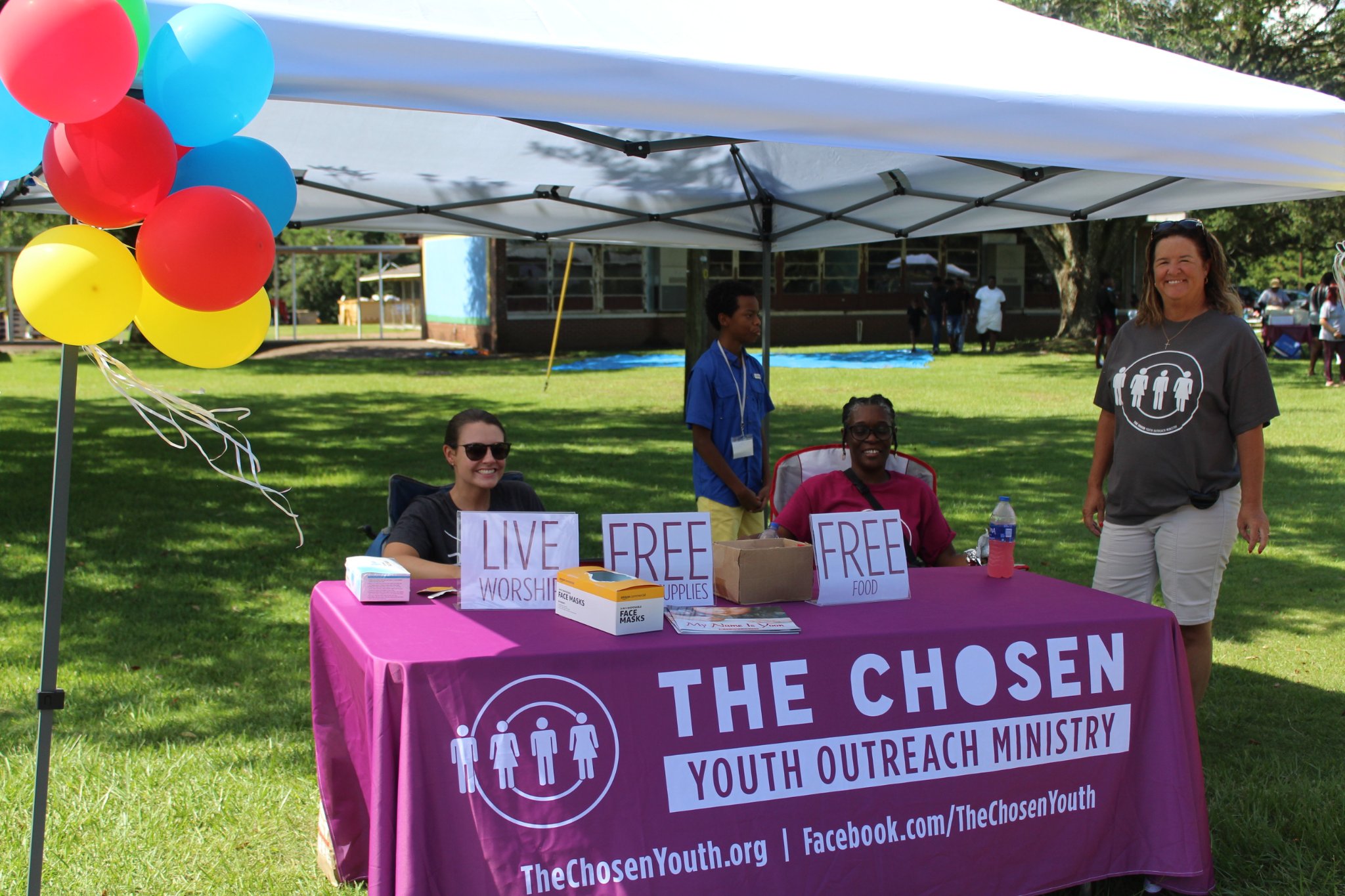
The Ministry began as a three-day Youth Conference in 2014, however, it has grown into a thriving organization dedicated to empowering youth through faith and service. Our signature annual event, the Back-to-School Bash, provides free food, school supplies, and a worship service to prepare kids for the new school year.
As a founding and active member of the ministry, I understood the heart of the organization’s mission and the need for a professional, cohesive brand to amplify our impact and inspire greater community involvement.
Details
Logo Design, Brand Identity, Website Design, Social Media
The challenge
Starting with nothing but a vision, The Chosen Youth Outreach Ministry needed a complete brand identity to reflect their growing mission and connect with their community.
The Ministry began as a three-day Youth Conference in 2014, however, it has grown into a thriving organization dedicated to empowering youth through faith and service. Our signature annual event, the Back-to-School Bash, provides free food, school supplies, and a worship service to prepare kids for the new school year.
As a founding and active member of the ministry, I understood the heart of the organization’s mission and the need for a professional, cohesive brand to amplify our impact and inspire greater community involvement.
Details
Logo Design, Brand Identity, Website Design, Social Media
The process
Building a brand from scratch meant every detail needed to align with our mission of empowering youth through faith, community, and action.
Discovery: Drawing on my deep knowledge of the organization’s values and goals, I created a foundation for the brand that reflects the joy and faith-driven purpose behind every event.
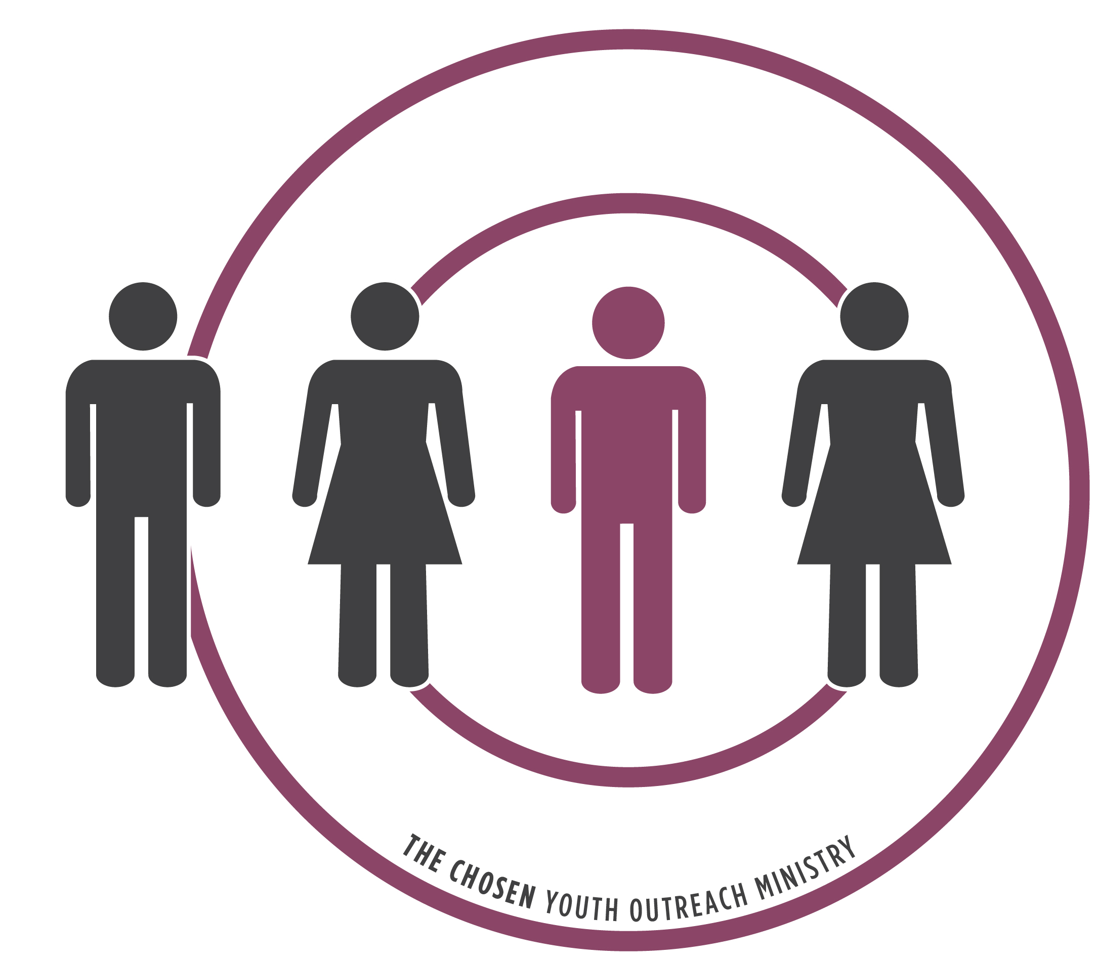
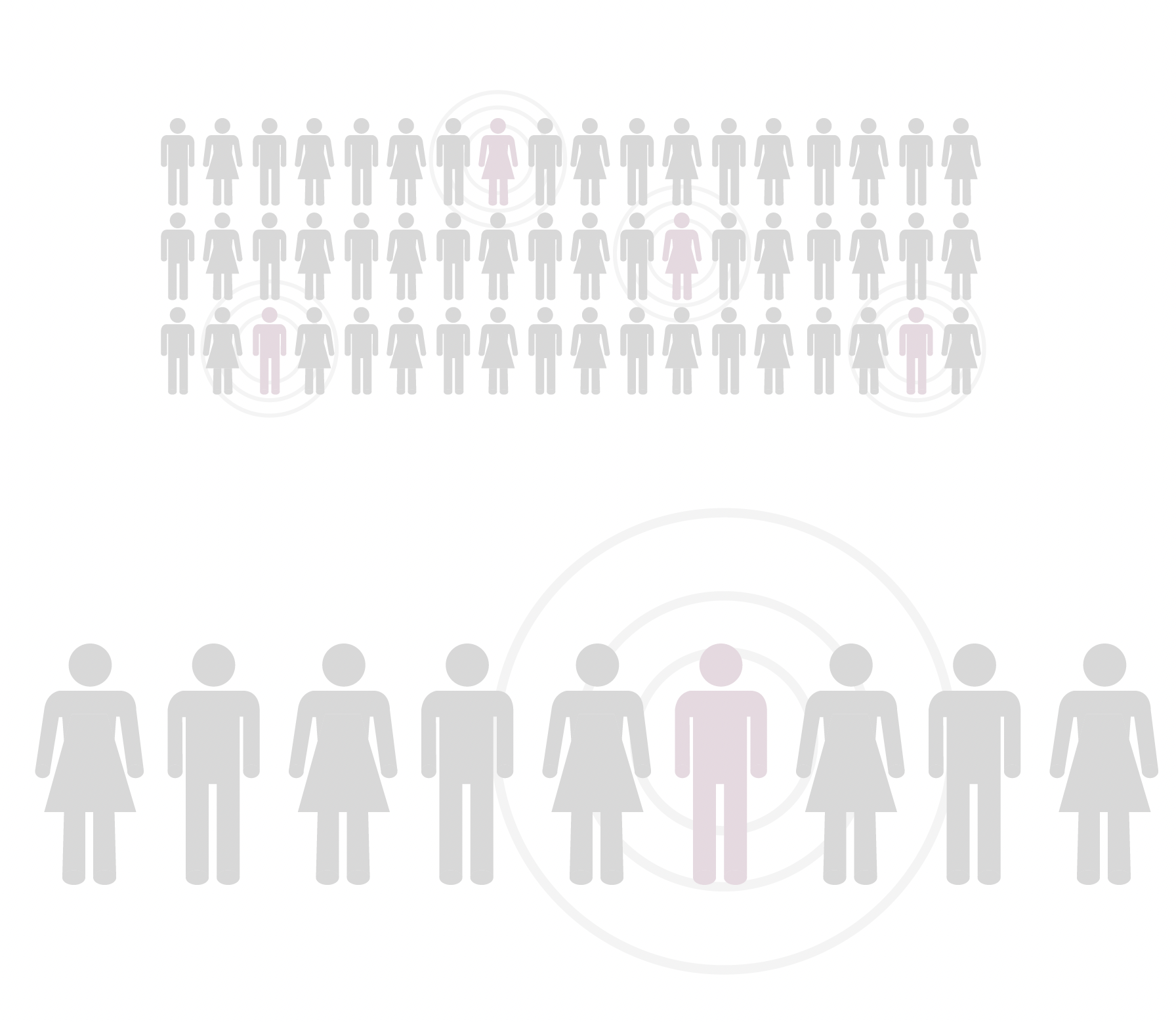
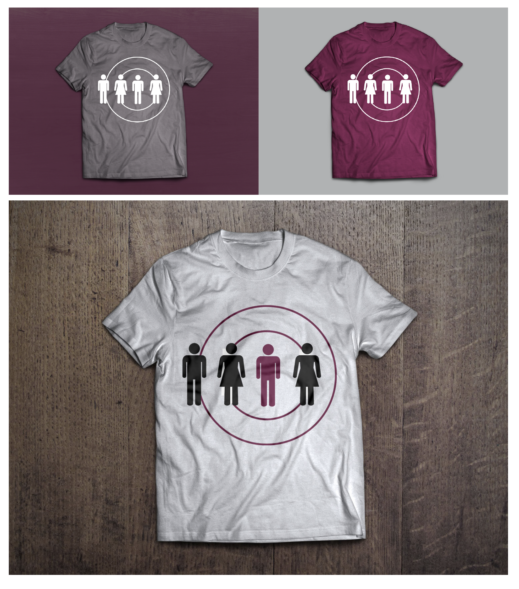
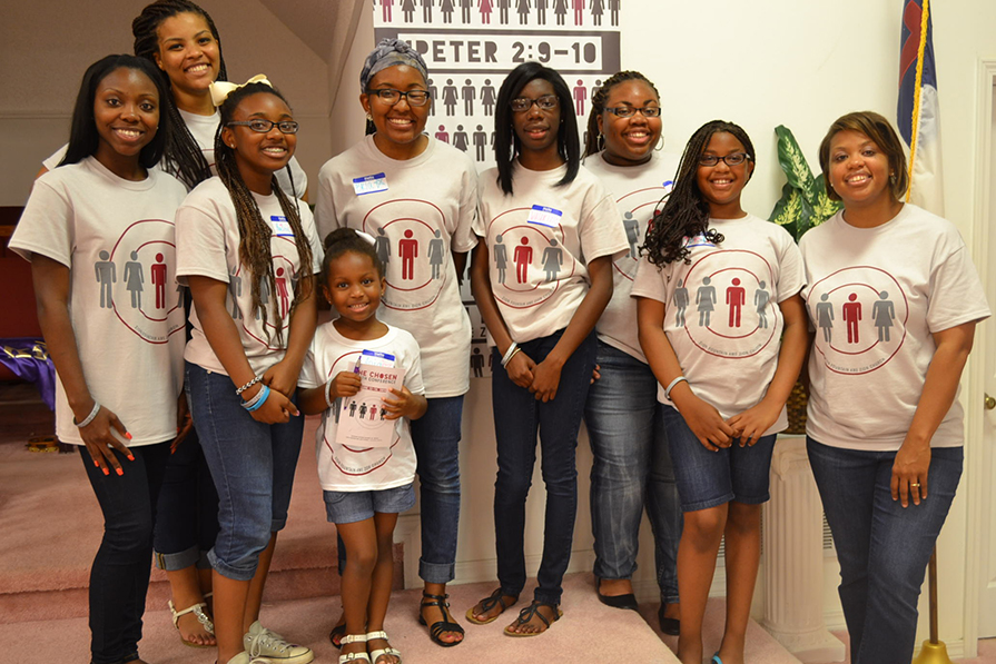
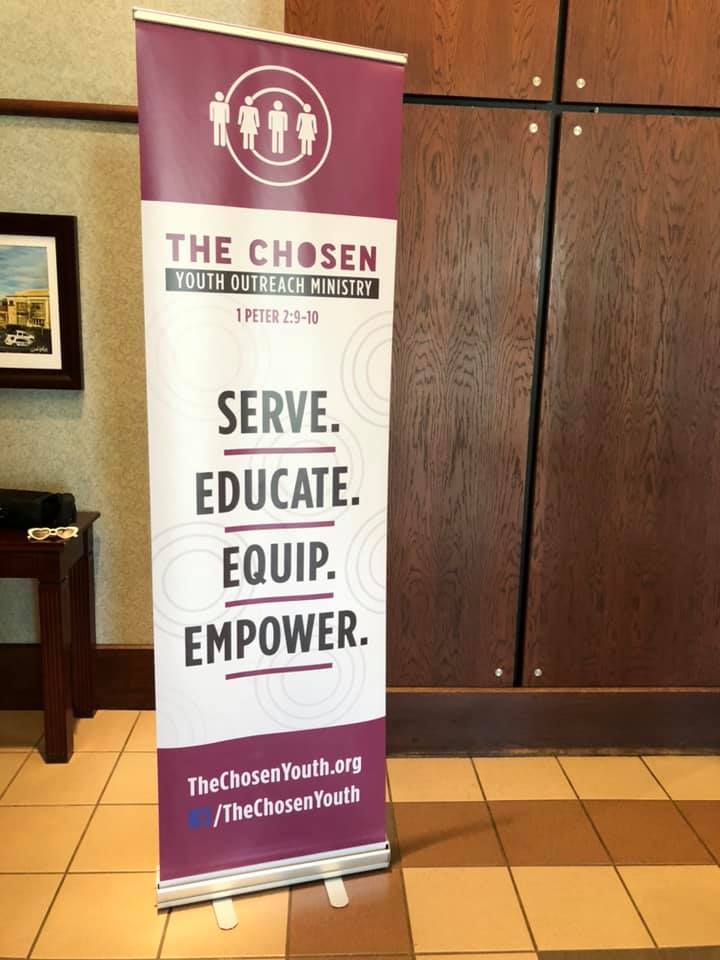
Logo Design: I designed a bold and uplifting logo based upon the idea that all it takes is one person to make a difference. Just like dropping a stone into water creates ripples that spread outward, the concentric circles symbolize the gradual expansion of influence or reach, starting from a central point and radiating outward. The circles also symbolize unity and interconnectedness. The primary logo is referred to as “Radius”.
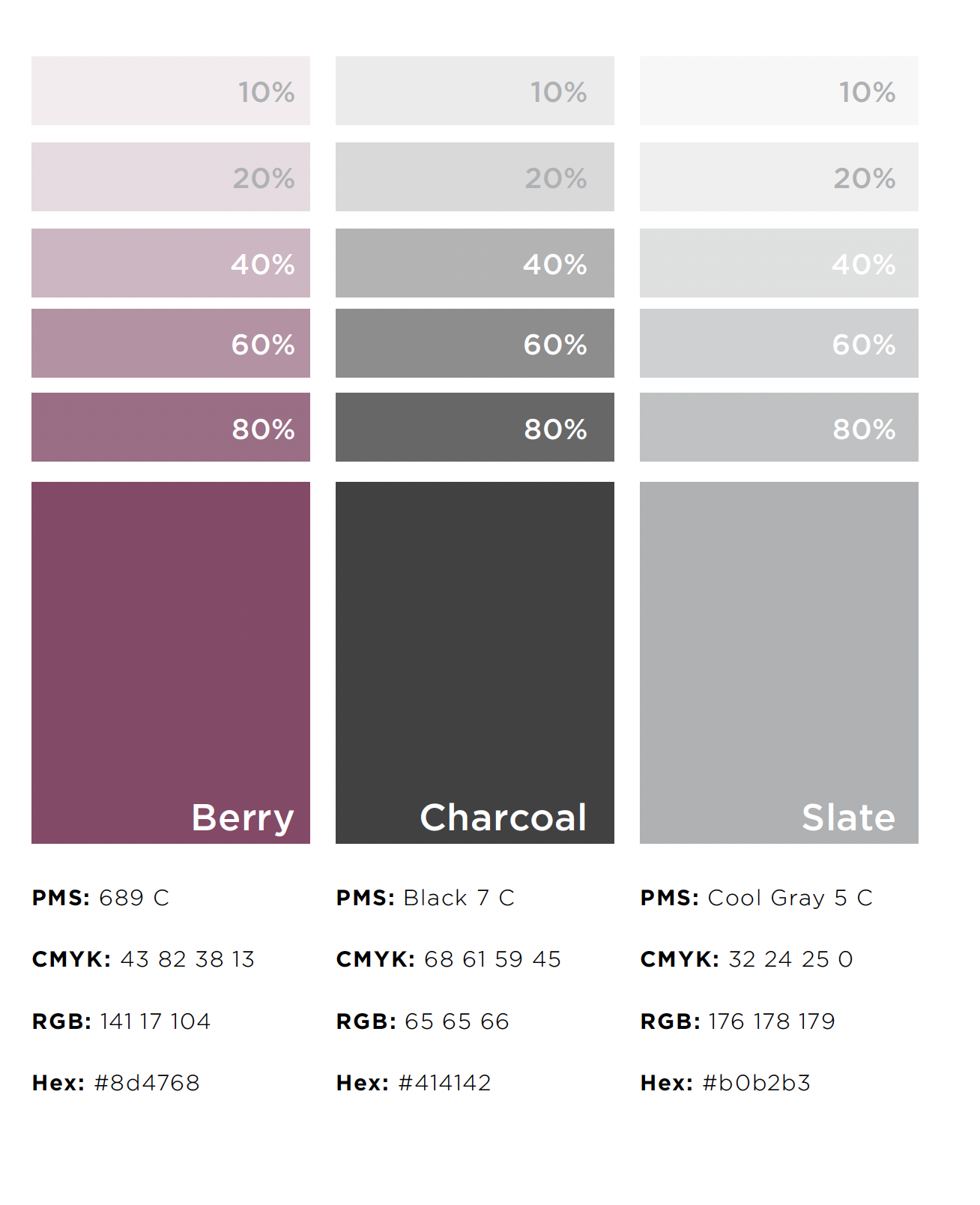
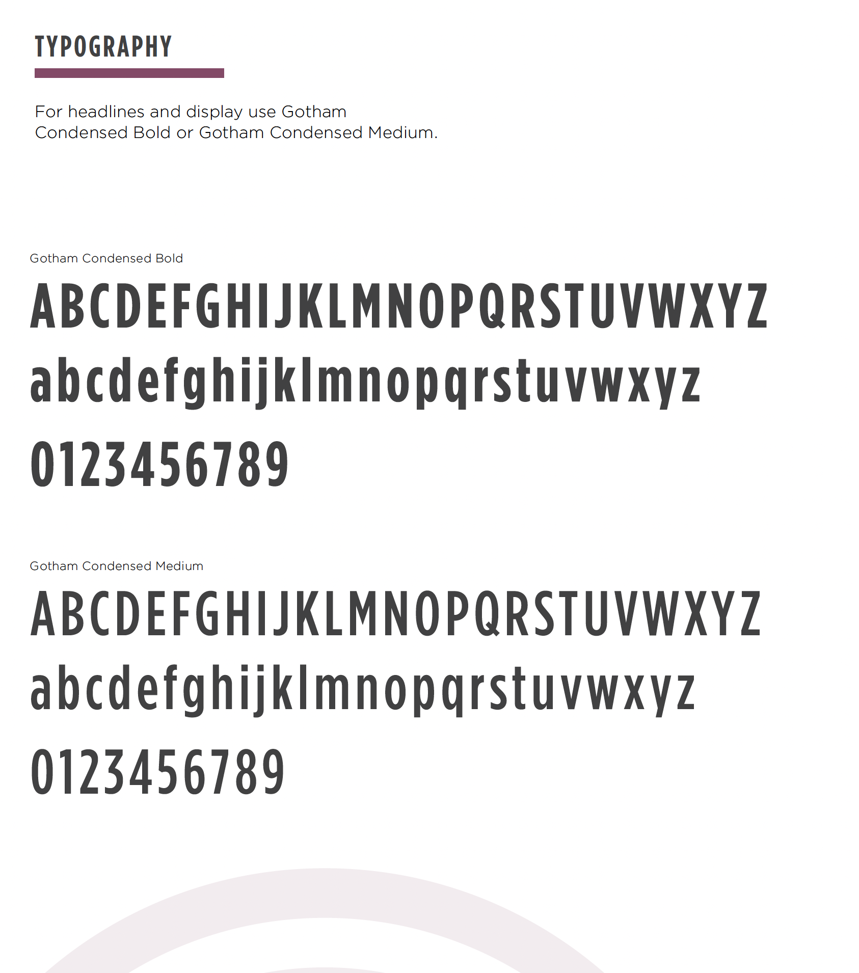
Brand Identity: I developed a cohesive look and feel—colors, fonts, and visuals—that communicate professionalism while remaining approachable.
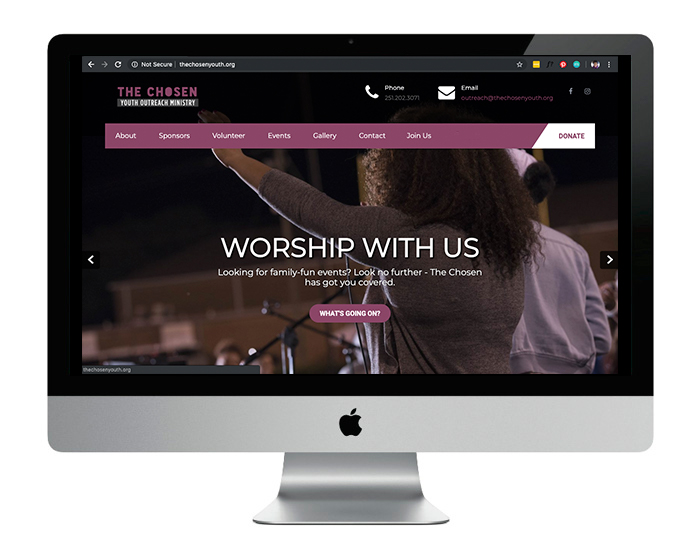
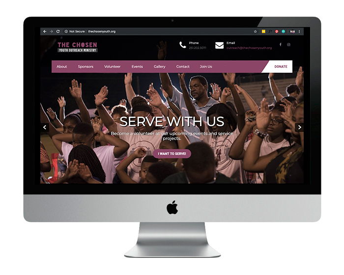
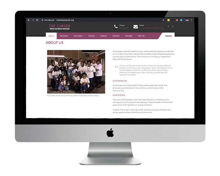
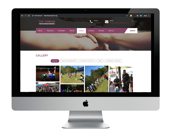
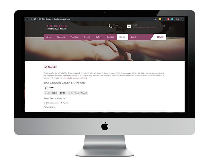
Website Design: The website was designed to serve as a central hub for event information, donations, and volunteer opportunities, making it easier for the community to get involved.
Being both a founder and the creative behind the brand allowed me to ensure every element truly reflected the spirit of The Chosen Youth Outreach Ministry.
The results
The Chosen Youth Outreach Ministry now has a cohesive, professional brand that amplifies its mission and inspires action.
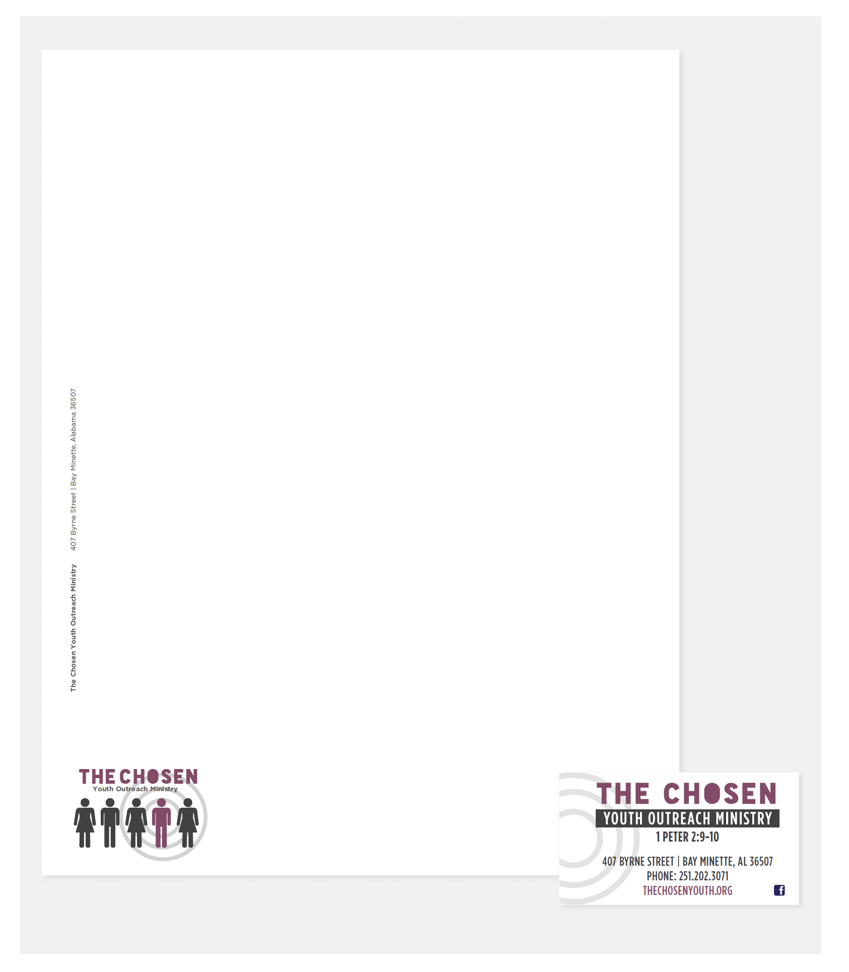
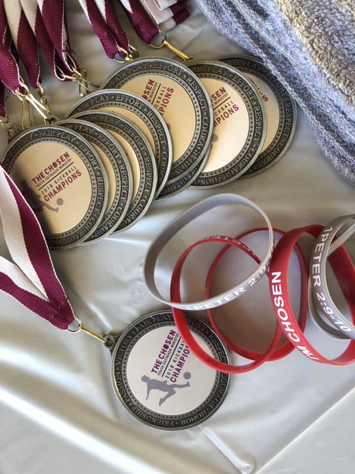
With a polished logo, cohesive brand identity, stationery and functional website, the organization is equipped to engage its audience on a larger scale. The Back-to-School Bash, along with other annual events, now has the branding to match its incredible impact, helping us attract more volunteers, donors, and attendees.
Ready to build a bold brand that inspires action?
Let’s make it happen.
CHECK OUT MORE WORK
Featured projects